How Do You Turn Yourself Into a Rick and Morty-Style Character From a Photo?
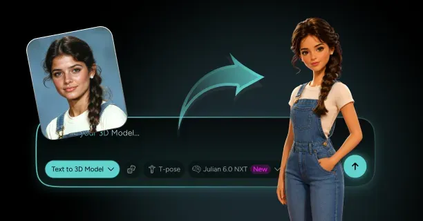
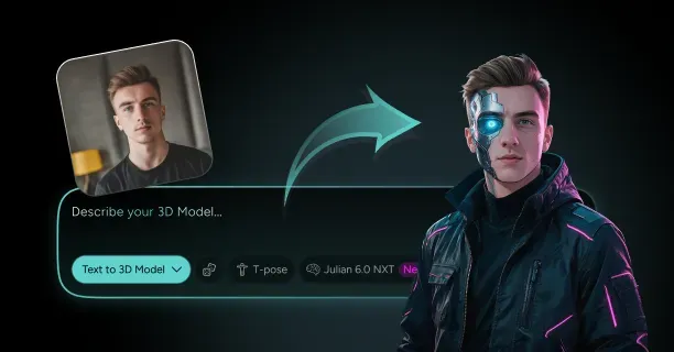
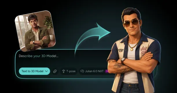
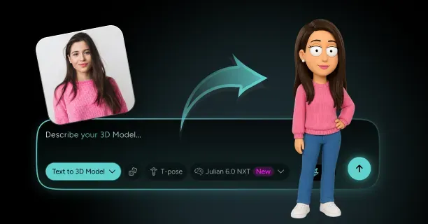
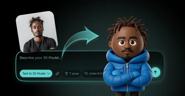
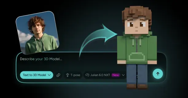
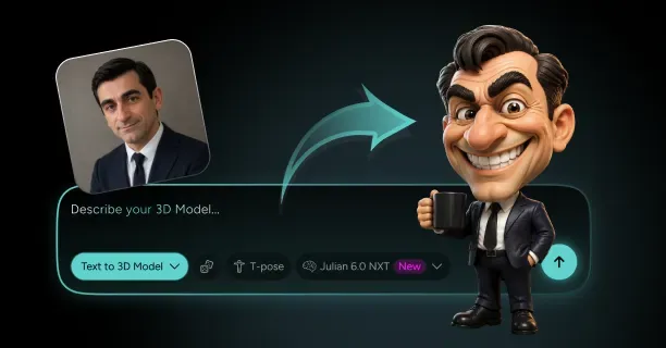
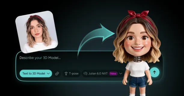
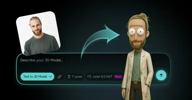
To turn yourself into a Rick and Morty-style character from a photo, upload two or three high-resolution reference shots (front, three-quarter, and profile) to Threedium and describe the show's specific geometry in the prompt: an egg-shaped skull, pencil-thin limbs, oversized flat-white eyes with dot pupils, and a single wobbly brow line instead of separate eyebrows. The Julian NXT generator maps your facial landmarks onto those cartoon proportions, builds a toon-friendly texture set, rigs the mesh, and hands you a model you can export to GLB, USDZ, or FBX. That complete photo-to-mesh path is what separates a real rick and morty character creator from the flat 2D filters that stop at a single square image.
The distinction matters more than it sounds. Most tools that turn a selfie into an interdimensional scientist give you a stylized picture; a 3D pipeline gives you a rotatable, riggable, printable, engine-ready asset that holds the style from every camera angle, which is exactly where the wobbly-line aesthetic gets hardest. One framing note before you start: this is style parody. You are building a character of yourself in the visual language of a show, not extracting or reusing official Adult Swim assets, and that distinction shapes both the design choices below and what you can legally do with the result.
Which Selfie Angles Capture the Features a Rick and Morty Stylization Needs?
The show's design language throws away almost everything a normal portrait pipeline cares about. There is no nose shading, no cheekbone structure, no skin texture, no jaw definition worth speaking of. What survives stylization is a very short list: skull silhouette, hairline shape, brow position relative to the eye line, nose profile as a single curved line, mouth width, and chin projection. Your reference set needs to nail those six and nothing else.
Shoot a straight-on front view with a neutral expression and your hair pushed back, because the hairline does enormous work here. Then shoot a true side profile at ninety degrees, the only view that tells the generator whether your nose reads as a bump, a hook, or a long slope. Add a three-quarter at forty-five degrees to resolve depth across the temples and jaw.
- Lighting: flat, diffuse, front-facing. Window light on an overcast day is ideal. Hard side light bakes shadows into the reconstruction and fights the flat-color target.
- Resolution: at least 2048 pixels on the long edge per shot. Below roughly 1200 pixels the hairline and brow line lose the pixel density needed to become distinct forms.
- Framing: head and shoulders, camera at eye height, at least a 50mm equivalent focal length. Phone wide lenses at arm's length inflate the nose by fifteen to twenty percent.
- Expression: mouth closed, eyes open, no smile. Teeth and squint lines are noise this style discards anyway.
- Glasses: shoot one set with and one without if you wear them. Glasses in this style are usually rebuilt as separate geometry, not textured onto the face.
Avoid beauty-mode phone cameras entirely. Skin smoothing and automatic face slimming erase exactly the asymmetries this style exaggerates for character. Shoot in a manual or pro mode with all enhancement off, and check that the file is not a heavily compressed 200 KB JPEG before you upload it.
How Do You Write a Prompt That Reads as C-137 Instead of Generic Cartoon?
The failure mode for every rick and morty ai generator is producing a generic western cartoon: rounded head, cute proportions, soft outlines, friendly colors. That output is technically a cartoon and completely wrong. The fix is to write your prompt in geometry and rules, not in show names. Describing shapes gets you the style; naming the show gets you an averaged mush of everything the model has ever seen tagged with those words.
Build the prompt in four blocks: head construction, eye construction, limb and torso construction, and surface treatment. Each block should be four to eight concrete clauses. Here is the structure that works:
- Head: tall egg-shaped cranium, widest at the temples, narrowing to a small chin; forehead occupying roughly forty percent of face height; ears small, low-set, and simple.
- Eyes: two large flat white ovals set wide apart, small solid dot pupils, no iris, no eyelashes, no visible sclera shading; one continuous wobbly line above both eyes serving as the brow.
- Body: narrow sloping shoulders, tube torso with no muscle definition, arms and legs the thickness of pipes, four-fingered hands, simple wedge feet.
- Surface: flat unshaded color fills, no gradients, no specular highlights, uneven hand-drawn contour line of variable thickness, adult animation aesthetic.
Add two or three negative constraints, because this style is defined as much by absence as presence: no realistic skin texture, no anime eye highlights, no PBR metallic or glossy surfaces, no thick uniform outline. That last one matters. A uniform outline reads as a different sitcom style entirely, which is why a clean, thick, uniform sitcom outline is a genuinely different job from this one despite both being adult animation.
How Does Threedium's AI Translate Your Face Into Roiland-Style Proportions?
Under the hood, the process is a landmark extraction followed by a proportion remap. The system reads your reference images, locates the standard facial landmark set (eye corners, nose bridge and tip, mouth corners, jaw perimeter, hairline), then measures the ratios between them rather than their absolute positions. Your interocular distance relative to face width, your nose length relative to face height, and your mouth width relative to jaw width are the three measurements that carry most of your identity.
Those ratios then get pushed through the style's own proportion targets. Your real head might be a 1:7.5 head-to-body ratio; the target is closer to 1:5.5 to 1:6 with a cranium noticeably taller than it is wide. Your eyes occupy maybe eighteen percent of face width each; the target pushes them toward thirty percent. The remap is proportional rather than absolute, which is why two people put through the same stylization still look like two people: if your eyes sit close together in life, they sit relatively close together on the stylized head, just at three times the size.
The generator then builds mesh geometry to match, unwraps UVs, and assigns flat base colors sampled from your prompt's palette instructions rather than from photographic skin tones. This is a deliberate divergence: a photo-derived skin color would land somewhere in the tan-to-brown range with subtle variation, and the show's palette is a small set of flat swatches with essentially zero variation across a surface. Sampling your literal skin tone is the single most common reason a photo to rick and morty style conversion looks almost right but not quite.
Choosing Your Archetype: Mad Scientist, Nervous Sidekick, or Interdimensional Original?
Before you generate anything, pick an archetype. The show's cast is built from a handful of body-and-attitude templates, and choosing one gives your prompt a coherent target instead of a pile of unrelated adjectives. Your archetype determines posture, limb proportion, wardrobe, palette, and expression baseline all at once.
| Archetype | Head-to-body ratio | Posture | Signature detail | Best for |
|---|---|---|---|---|
| Mad scientist | 1:6 to 1:6.5 | Forward hunch, shoulders raised | Spiked hair, lab coat, drool | Group casts, garage-lab scenes |
| Nervous sidekick | 1:5 to 1:5.5 | Rounded shoulders, chin tucked | Wobble mouth, plain tee, wide eyes | Paired characters, reaction shots |
| Interdimensional original | 1:5.5 to 1:6 | Your own natural stance | One alien or tech feature | Personal avatars, print figures |
| Bureaucrat or authority | 1:6 | Stiff, upright, arms at sides | Uniform, badge, blank expression | Crowd scenes, background cast |
| Alien species variant | 1:4 to 1:7 | Deliberately non-human | Extra eyes, odd limb count, skin hue | Full stylization freedom |
The interdimensional original is the recommendation for anyone who wants a model they will use long term. Direct parody characters age fast and read as costume, while an original design in the show's visual grammar reads as yours and avoids being a near-copy of a specific copyrighted character.
How Do You Dial In the Egg-Shaped Head and Noodle Limbs Without Losing Your Likeness?
The tension in every caricature pipeline is that pushing toward the style pushes away from resemblance. The way through is to separate features into two buckets: style-owned and identity-owned. Style-owned features get pushed to the target with no regard for your anatomy; identity-owned features get exaggerated but never replaced.
Style-owned: cranium shape, limb thickness, hand topology, ear size, neck length, body proportion. Push all of these fully. Identity-owned: hairline shape, nose profile line, brow angle, mouth width, chin projection, and any distinctive asymmetry. Those six are your levers, and the rule is to exaggerate each by roughly twenty to forty percent beyond reality rather than normalizing it.
For the noodle limbs, the practical spec is arms and legs whose diameter stays within roughly ten percent variation from shoulder to wrist. Real arms taper noticeably and bulge at the forearm; these do not. Set the upper arm diameter at about one-third of head width and hold it. Legs run slightly thicker, around forty percent of head width, with no calf swell. The moment you add anatomical tapering, the character stops reading as this style and starts reading as generic stylized human.
Setting the Eyes: Big White Ovals, Dot Pupils, and the Single Wobbly Brow Line
The eyes are the highest-leverage element in the entire model and the one most likely to be wrong out of the box. The specification is unusually strict. Each eye is a large oval of pure flat white with no shading, no ambient occlusion, and no rim darkening. Inside sits a small solid dot pupil, typically eight to twelve percent of the eye's width. There is no iris ring, no highlight dot, no eyelash geometry, and no visible upper lid unless the character is mid-blink.
Above both eyes runs a single continuous line. Not two eyebrows: one line that passes over both eyes, dipping and rising, with variable thickness. It is the most distinctive graphic element in the whole design language and the thing most stylization attempts miss. That line is the primary carrier of expression, and because it is a single connected stroke it has to be authored as one piece of geometry or one texture element, never as two separate brow objects.
Do not let any renderer put a specular highlight on the eye whites. A single glossy dot instantly converts the look from adult animation into 3D cartoon. Set eye material roughness to 1.0, specular to 0, and if your engine has a forced minimum specular, use an unlit or emissive material for the eyes instead.
Picking a Skin Tone From the Show's Flat Palette (and When to Go Full Alien)
The show's human skin tones are a narrow set of desaturated, slightly yellow-to-pink flat swatches. They are noticeably less saturated and slightly cooler than real skin. If you sample your actual skin color from a photograph and use it directly, the result looks like a 3D model wearing a photograph, not a drawing. Pull the saturation down by roughly twenty to thirty percent and lift the value slightly, then flatten it to a single swatch.
Critically, there is no second skin tone. No blush on the cheeks, no darker tone under the jaw, no lighter tone on the forehead. One flat fill covers the entire face and body, and all shape reading comes from the contour line and from a small number of interior detail lines. This is what separates this palette approach from the yellow-skin overbite conventions or the paper-cutout construction of the sibling cutout-animation stylizations, where flatness is achieved by completely different means. If you are comparing styles before you commit, the full set of turn-yourself-into-a-character workflows lays out how each one handles skin.
Going alien is the fun option and the technically safer one. The non-human palette is wide open: greens, purples, blues, oranges, greys. An alien hue frees you from the near-miss uncanny zone where a stylized human face is judged against a real one, and it gives your rick and morty character maker output an identity of its own.
- Human-adjacent: desaturated peach, pale sand, warm grey-tan. Safe, reads as a person, hardest to make interesting.
- Classic alien: mid green, teal, lavender. Instantly reads as a background species from the show.
- Extreme: orange, magenta, deep blue, or a two-tone split. Works best with a simplified body and an unusual head shape.
- Never: gradient skin, subsurface scattering, photographic skin texture, or any per-pixel variation across a body surface.
Adding Wardrobe: Lab Coat, Yellow Tee, or Portal-Tech Gear?
Wardrobe here is built from flat shapes, not cloth simulation. A lab coat is a rectangle with two lapel triangles and a hem line; a tee shirt is a tapered box with two sleeve tubes. No folds, no drape, no wrinkle normal maps. If you can draw the garment with five straight-ish lines, it is correctly stylized.
Model garments as separate mesh objects rather than as texture painted on the body. There are two reasons. First, a separate mesh lets you offset it fractionally from the body surface (about 0.5 to 1 percent of character height) so the contour line renders around the garment silhouette, which is how the show reads. Second, separate garment meshes let you swap outfits later without regenerating the character, which matters enormously if you plan a series of renders.
Portal-tech gear is where you can spend detail budget. A portal gun analogue, a wrist device, goggles, or a shoulder-mounted gadget gives your character a story hook and is the one element where slightly higher polygon density and a small emissive area are justified. Budget roughly 1,500 to 4,000 triangles for a hero prop, which is plenty for hard-surface shapes at this level of simplification.
Refining the Generated Mesh: Fixing Hair Spikes, Hands, and Drool Placement
For hair, the target is a small number of large, distinct clumps, typically four to eight, each a broad wedge with a flat tip rather than a needle point. Generated output often produces twenty or more thin spikes, which reads as anime rather than adult animation. Merge them down by deleting alternating spikes and scaling the survivors wider. Check the silhouette from directly overhead: the show's spiked hair reads as a fan or a crown from above, not as a uniform ring.
For hands, the show uses four fingers including the thumb. If your generation produced five, delete the ring finger, rebuild the webbing, and thicken every finger to roughly double what anatomy would suggest, since thin fingers collapse into mush past three meters from camera. Budget 400 to 900 triangles per hand.
Drool belongs at one mouth corner only, as a small teardrop of separate geometry with its own slightly translucent material, never as a painted texture streak. Painted drool moves with the UVs when the jaw opens and instantly looks wrong. Model it as a 40 to 120 triangle blob parented to the jaw bone, and if you want to be thorough, add a shape key that lengthens it so you can animate a drip.
How Do You Preview the Toon-Shaded Model in Turntable Before Committing?
A 360-degree turntable is the single most valuable checkpoint in this entire workflow, because the wobbly-line style is fundamentally a 2D convention being forced into 3D and it breaks at predictable angles. Preview the model rotating a full revolution with the toon material and outline active, at the same resolution you plan to render at, before you commit to rigging or export.
Watch for five specific failures as it turns:
- Brow line breakup: the single continuous brow stroke splitting into two separate marks between roughly thirty and sixty degrees of yaw. The most common failure by far.
- Pupil drift: dot pupils sliding off the eye white or disappearing behind the eye geometry at profile angles.
- Silhouette collapse: the hair fan reading as a single lump from the side, or the egg skull reading as a sphere from three-quarter rear.
- Outline dropout: the contour line vanishing where surfaces are nearly parallel to the camera, usually along the inside of arms and under the chin.
- Shading bleed: any soft gradient appearing anywhere on the skin, which means a light is leaking past your toon ramp.
Fix problems at this stage, not after rigging. Editing head geometry after a skin bind has been applied means redoing weights, and weights on pencil-thin limbs are the most tedious part of the entire job.
Exporting Your Portal-Hopper as GLB, USDZ, or FBX for Any Pipeline
Export format is dictated entirely by destination, and this style has one complication no other stylization has: the outline pass does not travel. Neither GLB, USDZ, nor FBX carries a post-process outline effect. If your outline is geometry (an inverted-hull shell), it exports fine as part of the mesh. If it is a shader or post-process effect, it exists only in the renderer you built it in and must be rebuilt on the far side.
| Destination | Format | Triangle target | Texture size | Outline approach |
|---|---|---|---|---|
| Blender render, hero stills | GLB or FBX | 60,000 to 150,000 | 2K | Freestyle or shader-based, rebuilt in Blender |
| Unity toon project | FBX | 15,000 to 40,000 | 1K to 2K | Inverted hull, or URP renderer feature |
| Unreal Engine | FBX | 20,000 to 60,000 | 2K | Post-process material, rebuilt in engine |
| Web or glTF viewer | GLB | 8,000 to 25,000 | 1K to 2K, KTX2 compressed | Inverted hull only |
| iOS AR Quick Look | USDZ | 10,000 to 40,000 | 2K | Inverted hull only, unlit material |
| VTuber or social VR avatar | VRM or FBX | 20,000 to 70,000 | 2K, few materials | Inverted hull, MToon-compatible |
| Resin 3D print | STL or OBJ | Not limited | None | None, delete outline shell entirely |
Set your scale before exporting, not after. Use meters as the base unit, with a character height of about 1.75 units. USDZ treats scale as physically meaningful, and an unscaled export will drop a forty-meter cartoon scientist into someone's living room. Check the up axis too: Y up for glTF-family formats, Z up for FBX into most DCC applications.
Keep material count low. Four to six materials is a comfortable target: skin, eyes, hair, garment, prop, and outline shell. Every additional material is an additional draw call and, in web contexts, additional load time. You can browse the broader 3D model generation workflows if your target pipeline has requirements beyond these defaults.
How Do You Fake Wobbly Linework and Line Boil in 3D?
This is the technical heart of the style and the reason a rick and morty 3d model is meaningfully harder than most cartoon stylizations. The show's look depends on two things that are native to hand-drawn 2D and hostile to 3D: a contour line with irregular, human thickness variation, and line boil, the frame-to-frame jitter that comes from a human redrawing the same shape slightly differently each frame. 3D is perfectly consistent by nature. You have to deliberately add imperfection back.
Everything below is standard non-photorealistic rendering practice, but the combination and tuning targets are specific to this aesthetic.
How Do You Translate Wobbly 2D Linework Into 3D Outline Geometry?
There are three viable outline methods and they have genuinely different tradeoffs. The inverted hull duplicates the mesh, flips its normals, pushes vertices outward along their normals, and renders it with backface culling inverted so only the pushed-out silhouette shows. The post-process edge detect runs a Sobel or depth-normal filter over the rendered frame. The screen-space line renderer traces geometric edges analytically and draws them as strokes.
For this specific style, inverted hull wins in most cases because the show's line thickness varies with the form rather than being a uniform screen-space width. You can control hull thickness per-vertex through a vertex color channel or a vertex group, which means you can make the line heavy under the jaw and light across the forehead exactly as a hand would draw it. Post-process edge detection gives you a mathematically perfect, mechanically uniform line, which is precisely the wrong quality.
The production answer for most people is a hybrid: inverted hull for the silhouette, plus painted lines in the albedo texture for interior details like the nose line, mouth line, and shirt collar. That combination survives export to GLB and USDZ intact and gives you the thickness variation the style needs. Set your hull offset in the range of 0.15 to 0.4 percent of character height, which lands around 3 to 7 millimeters on a 1.75 meter figure. Thinner disappears at distance; thicker reads as the heavier outline convention used in other adult animation styles.
Faking Line Boil in 3D: Shader Noise That Mimics Frame-to-Frame Jitter
Line boil is why clean 3D toon renders feel sterile even when every other element is correct: a hand-drawn outline moves a pixel or two in a random direction every frame because a human redrew it. Reproducing it means adding temporal noise to your outline offset, and the implementation in a vertex shader is straightforward. Take a per-vertex random seed (stored in a UV channel or vertex color), feed it plus a time value into a noise function, and use the result to perturb the hull offset direction and magnitude. The key parameter is not the noise amount but the update rate. If the noise updates every frame at 60 fps, you get a shimmering mess that looks like a rendering artifact. Hand-drawn animation typically boils at 12 fps, sometimes 8.
So quantize your time input. Instead of feeding continuous time, feed floor(time * 12) / 12. That holds each noise state for two frames at 24 fps or five frames at 60 fps, which reads exactly like animation on twos. This one line of shader math is the difference between "3D pretending to be 2D" and "convincing."
- Boil rate: 8 to 12 updates per second. Twelve is the safe default.
- Boil amplitude: 0.5 to 2 pixels equivalent at your target render resolution. More than that reads as a glitch effect.
- Noise type: low-frequency value or Perlin noise. High-frequency white noise produces a fizzing edge rather than a wobble.
- Where to apply: the outline hull only. Boiling the base mesh makes the whole character vibrate and looks like a physics error.
Turn line boil off completely for any model destined for a VTuber pipeline or a social VR platform. Constant vertex animation on a shared avatar burns GPU budget for every viewer in the scene and many platforms reject or strip custom vertex shaders outright.
Why Dot Pupils on Flat White Eyes Break Standard Eye Rigs (and the Workaround)
Standard character rigs treat eyes as spheres. Two eyeball meshes rotate inside sockets, a look-at constraint aims them at a target, and the iris and pupil are textured onto the sphere's front face. That entire model fails here, for a mechanical reason: this style's eyes are flat white ovals, essentially 2D shapes tacked onto the front of the head, and the dot pupil needs to slide across that flat surface rather than rotate around a sphere center.
If you use a spherical eye rig, the pupil foreshortens into an ellipse and drifts toward the edge of the visible white as it rotates, then disappears entirely past about thirty degrees. In the show, the pupil stays a perfect circle at all times and simply translates within the eye white. There are three workarounds, in increasing order of quality:
- UV offset: keep the pupil in the eye texture and drive its position with a UV offset node controlled by a bone or a pair of float parameters. Cheapest, works everywhere, exports to GLB only if your engine supports animated UV offsets.
- Floating pupil geometry: model the pupil as a separate flat disc that slides across the surface of the eye white, offset by about 0.1 percent of head width. Exports cleanly in every format and is the most compatible option.
- Shrinkwrapped pupil: the floating disc constrained to the eye white surface so it follows any curvature. Best quality on a head with a curved eye plate, slightly more setup.
For most builds, option two is correct. A twelve to twenty-four sided disc costs almost nothing, survives every export path, and lets you drive expression by scaling it: shrinking both pupils to half size is the show's standard shock expression.
Recreating the Show's Skin Palette: Flat Color Without PBR Shine
Modern 3D pipelines are built end to end around physically based rendering. Every default material has roughness, metallic, specular, and normal inputs, and every default lighting setup produces gradients. This style needs the opposite of all of it: a single flat color per surface with no lighting response whatsoever, or at most a two-step hard ramp.
The reliable settings, whichever engine you are in: base color set to your flat swatch, roughness 1.0, metallic 0.0, specular 0.0 or as close as your material system allows, and no normal map at all. Then either replace the shading model with unlit, or clamp the lighting through a two-step toon ramp with a hard threshold.
Build your palette as a small locked set: one skin swatch, one hair swatch, one to three garment swatches, one prop swatch, plus pure white for eyes and a very dark grey (not pure black, around 10 to 15 percent value) for lines. Eight to twelve total colors for an entire character is normal.
Toon Shading vs. Unlit Materials: Which Gets Closer to the Adult Swim Look?
Unlit wins for fidelity. Toon shading wins for practicality. Which you choose depends on whether your character exists alone against a flat background or inside a lit 3D environment with other objects.
A fully unlit material ignores lights entirely and renders your flat swatch at exactly the authored value in every pixel. That is precisely what a hand-drawn cel is, and it produces the closest match to the reference. The problem is that an unlit character dropped into a lit garage-lab scene looks pasted on, because it does not respond to the scene's warm key light or its green portal glow while everything around it does.
A two-step toon ramp keeps that scene integration. The lit side gets your base swatch; the shadow side gets a version fifteen to twenty-five percent darker with a hue shift toward blue, with a hard transition at near-zero smoothing width.
| Setup | Style accuracy | Scene integration | Export compatibility | Use when |
|---|---|---|---|---|
| Fully unlit | Highest | None | Excellent, glTF unlit extension | Flat background, avatar, sticker, print reference |
| Two-step toon ramp | High | Good | Needs shader rebuild per engine | Lit 3D scenes, animation, game levels |
| Three-step ramp with rim | Moderate | Excellent | Needs shader rebuild per engine | Dramatic lighting, portal glow scenes |
| Standard PBR | Very low | Excellent | Universal | Never, for this style |
Keeping the Unibrow Eye-Line Readable From Every Camera Angle
The single continuous brow line is a 2D graphic convention with no 3D equivalent, and getting it to hold at all angles is the hardest individual problem in this entire style. A real brow follows the brow ridge, which curves back around the skull. This style's brow is a single stroke drawn across the front plane of the face as if the face were flat. Those two facts are in direct conflict the moment the camera moves off center.
The workable solution is to build the brow as a thin flat ribbon of geometry floating just in front of the forehead, roughly 0.3 to 0.6 percent of head width off the surface, spanning both eyes as one connected strip. Give it a slight forward curvature (much flatter than the skull), so it stays visible in three-quarter views without popping off the silhouette in profile.
Vary the ribbon's thickness along its length: taper it toward the outer ends and thicken it over the inner corners, with maybe forty percent variation from thinnest to thickest point. A brow line of uniform width reads as machine-drawn.
Spiked Hair, Stubble, and Drool: Where Sculpted Clumps End and Texture Begins
There is a clean dividing rule for every one of these details: if it changes the silhouette, it must be geometry; if it does not, it must be texture. Hair changes the silhouette dramatically, so it is always geometry. Build it as sculpted clumps rather than hair cards or alpha planes. Alpha planes are the standard solution for realistic hair, and they are wrong here for two reasons: they require alpha testing or blending that fights outline rendering, and their soft edges contradict the hard-contour aesthetic. Solid wedge clumps with four to eight per hairstyle, at maybe 200 to 600 triangles each, give you a crisp silhouette and take an inverted-hull outline cleanly.
Stubble does not change the silhouette, so it is texture. Paint it as a flat, slightly darker fill in the beard region with a hard, irregular boundary, not as a soft gradient or a noise pattern. The show's stubble reads as a solid shaded shape with a wobbly edge. A stippled or dotted stubble texture will alias badly at any distance and reads as photorealistic detail imported by mistake.
Drool sits in the ambiguous middle and lands on the geometry side, because a drool string that hangs below the jaw absolutely changes the silhouette. Model it, keep it small (40 to 120 triangles), give it its own material with slight translucency, and parent it to the jaw. Bloodshot eyes are the opposite case: pure texture, thin red lines painted into the eye white, kept sparse at three to six strokes per eye so they read as a design element rather than as medical detail.
Check every texture-side detail at your minimum intended viewing distance before you commit. Painted stubble, bloodshot lines, and mouth interior detail that read perfectly at a 2K close-up can turn into grey mud at the sizes a Discord avatar or a mobile viewer actually displays. If a detail is not legible at 256 pixels, it is costing you texture memory for nothing.
Justin Roiland-Era Design Rules: Simple Shapes, Asymmetry, and Ugly-on-Purpose Details
The early design language of the show, established during the Justin Roiland era, follows a handful of rules that are easy to state and hard to follow because they run against every instinct a 3D artist has been trained on. Understanding them explicitly is what lets you generate on purpose rather than by trial and error.
- Build from the fewest shapes that work. A head is an egg. A torso is a tube. An arm is a pipe. If a form can be described in one word, the design is on target.
- Break symmetry deliberately. One eye larger. Mouth off center. Shoulders at different heights. Perfect bilateral symmetry, which is 3D's default, is the clearest sign of a model built without style awareness.
- Ugly is a design goal, not a failure. Sagging jowls, visible pores drawn as three dots, an unattractive mouth shape. The style actively resists flattery, and a handsome stylization is an off-model stylization.
- Detail is spent on props, not anatomy. The characters are simple; the sci-fi gadgets and background machinery carry the visual density.
- Line weight is inconsistent on purpose. Contours thicken and thin unpredictably, the way a hand with a brush pen does. Uniform line weight is the mark of vector, not animation.
Asymmetry is the easiest of these to implement and the most impactful. After generation, before rigging, break symmetry in three places: shift the mouth horizontally by two to four percent of face width, scale one eye by three to six percent relative to the other, and rotate one ear slightly.
The same asymmetry principle is what separates a good rick and morty style art generator result from a merely competent one. Generation systems trend toward the mean, and the mean is symmetrical. You are the one who has to push it back off center.
Why the Show's Pencil-Thin Limbs Cause Rigging and Skinning Problems
Thin limbs are a genuine technical liability, not just an aesthetic choice. Standard skinning assumes a limb has enough radial volume that vertices near a joint can be blended between two bones and still describe a rounded form under rotation. When the limb is barely thicker than the bone itself, that blend has nowhere to go, and elbows pinch to zero volume at anything past forty-five degrees of bend.
Four mitigations, in the order you should try them:
- Add loops at joints. Three to four edge loops within roughly one limb-diameter of each elbow and knee. This alone fixes most pinching. Two loops is not enough on a limb this thin.
- Cap the bend range. Constrain elbow and knee rotation to about 120 degrees. The show almost never bends a limb further, so you lose nothing.
- Use rigid weights near the joint. Instead of a smooth falloff, weight vertices almost fully to one bone with a narrow blend band. Thin cartoon limbs read better with slightly rigid deformation than with mushy smooth binding.
- Add a corrective shape key. One shape key per joint driven by bend angle, restoring volume at full flex. Worth doing on hero models, overkill for a static avatar.
For facial animation, note that this style's face is driven by the brow line and mouth shape rather than the subtle muscle movement a full 52-blendshape ARKit set is designed for. Generate the full set anyway if the character will be a live avatar, since face tracking expects it, but expect roughly a dozen blendshapes to carry almost all visible expression.
Building a Portal Prop: Emissive Green Swirl Materials That Hold Up in 3D
A portal is the one element in this whole style where you are allowed, even encouraged, to break the flat-color rule. The show's portals are bright green swirling discs with a glowing edge, and they are the primary light source in most scenes that contain one. Getting one right transforms a static character render into a scene.
Build the portal as a flat disc or a very shallow ellipsoid, not a sphere or a tunnel. Twelve to thirty-two sided is plenty. Give it an emissive material with a bright saturated green base, roughly in the range of a 60 to 75 percent saturated mid-to-bright green, and an emissive strength of two to five in a linear renderer. The swirl comes from an animated texture: a spiral gradient rotated over time, or two overlapping noise layers scrolling in opposite directions at different rates.
The edge is what sells it. Add a brighter, whiter ring at the boundary, roughly five to ten percent of the disc radius wide, with emissive strength two to three times higher than the interior, then a few irregular green splatter shapes just outside it so the portal is not a perfect circle. Add a real green point light at the portal's position with a range of two to three meters, so a character standing in front of it catches a green rim. Budget the whole prop at 200 to 1,000 triangles; it is a flat shape and every extra polygon is wasted.
Frequently Asked Questions About Rick and Morty Character Creators
Common questions about turning a photo into a stylized 3D character: cost, output, and limits.
Is there an official Rick and Morty character creator?
There has been no consistently available official character creation tool from Adult Swim. Various promotional web toys, mobile game avatar systems, and tie-in apps have appeared and disappeared over the years, and the show's mobile games have included limited character customization within their own art assets. None of them export a usable 3D file.
What that means practically: if you want a character you own the file for, and one you can render, rig, print, or put in a game, you are working with a general-purpose stylization pipeline rather than an official product. That is also why the style-parody framing matters, since you are building in the visual language rather than assembling from licensed parts.
How much does a custom Rick and Morty-style portrait commission cost?
A 2D rick and morty portrait from photo, commissioned from a freelance illustrator, typically runs 25 to 120 US dollars for a single-character bust or half-body, with turnaround of three days to two weeks. Full-body single characters land around 60 to 200 dollars, and multi-character family pieces scale roughly linearly per figure with a small discount.
A custom 3D character is a different order of magnitude. A stylized, rigged, game-ready character from a freelance 3D artist generally runs 400 to 2,500 dollars depending on rigging complexity, texture work, and whether toon shading setup is included, with turnaround of one to four weeks. That gap is the practical case for AI generation: the 3D deliverable is what has real utility, and it is the one that has historically been priced out of reach for a personal project.
Can AI turn a photo into a Rick and Morty character for free?
For a 2D image, yes. Plenty of free web tools and general image models will produce a cartoon stylization from a selfie at no cost, with varying quality and usually with a watermark or a resolution cap. Those results are pictures, and the good ones are genuinely decent as pictures.
For a 3D model, free options are much thinner. Generating clean topology, usable UVs, a working rig, and multi-format export is computationally expensive, so platforms that offer it generally run free tiers as trials with limited generations, resolution caps, or restricted export formats. Expect a free tier to get you a preview and a paid tier to get you the exportable, rigged asset.
How is a 3D character different from a 2D Rick and Morty filter?
A rick and morty filter produces a single image from a single viewpoint. A 3D character produces geometry you can rotate, light, animate, pose, print, and import. The filter is an output; the model is an asset.
The concrete differences show up the moment you want a second image. With a filter, a new angle means a new generation and a result that will not quite match the first. With a model, a new angle is a camera move, and every render is consistent because it is the same object. The same applies to expression changes, wardrobe swaps, and adding the character to a scene with others.
What file formats can I export a Rick and Morty-style 3D model to?
The core export set is GLB for web and general interchange, USDZ for iOS AR Quick Look, and FBX for game engines and DCC applications. VRM is the relevant additional format if the character is destined for a VTuber or social VR platform, since it carries the humanoid rig, blendshapes, and MToon toon-shading parameters in one file.
For 3D printing you convert to STL or OBJ, which carry geometry without materials and are what every slicer expects. Remember to delete the outline hull before that conversion, since it has no physical meaning and will confuse the slicer.
What does not export in any format is a post-process outline, a custom toon shader graph, or a line boil vertex animation. Those are renderer-side effects. Anything you want to survive a file handoff has to exist as geometry, texture, or standard material parameters.
Can I make a pickle version or an alien version of myself?
Yes to both, and the alien version is genuinely easier than a human one. Describe the non-human features directly in your prompt: skin hue outside the human range, an unusual eye count or arrangement, extra limbs, antennae, an unconventional head shape. The style's design language is unusually permissive here because the show's own background species vary wildly in construction.
A vegetable or object version of yourself is the same technique applied harder: you keep only the identity-owned features (brow angle, mouth shape, nose line if there is a nose) and map them onto a non-human body form. In practice this means a very short feature list and a simple base shape, which is well within what a stylization pass handles. Expect to spend most of your refinement time on making sure the face features sit at a readable scale on a form that has no human proportions to anchor them.
Can I use my Rick and Morty-style character commercially?
If the character is an original design of yourself built in the show's visual conventions, commercial use is generally viable, because art style is not itself protected by copyright. If the character is a recognizable copy of a specific show character, commercial use is not viable and the work is a derivative one regardless of how it was produced.
Keep marketing clean of the show's name, logo, character names, and any implication of official affiliation. Trademark law is separate from copyright and is enforced more aggressively, and a product listing that leans on the title is a much bigger exposure than the artwork itself. Describe your work by what it is: an original stylized 3D character.